
Researching Titles
We wanted our titles to match what our audience research feedback suggested, meaning we should have a standout colour for the text on a dark background. I researched film titles of a similar genre to ours and noticed that a lot of them had many similarities.

Maniac (1980)
Jealousy (2013)


Insidious (2010)
Red is often chosen when it comes to finding a colour of text that stands out. This is most likely because it resembles danger and is associated with alarms. This could work for our film as we intend to have the antagonist in a dangerous position before the title of the film will come up. However the popular film of the same genre and topic as ours, 'Pulp Fiction' did not use this colour in an attempt to stand out and step away from the norm.
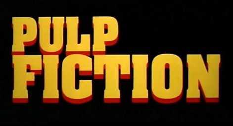
Pulp Fiction (1994)
As you can see, they have used yellow text instead of the more common red, however they still have red elements to the text showing that it is still of a similar genre to other films, symbolising danger. Because it is not the norm, this became iconic to this film.
Although our film is a crime-drama, it has some similarities to an action so i also researched a a few action film titles. I noticed that many of these use bold, large fonts fonts but are very plain in colour, so i think we could use elements of everything I have researched to come up with a font, size and colour that suits our titles well.

Battleship (2012)
Total Recall (1990)


Desperate (1947)
I also took a look at how we should display the titles for the beginning of our opening which will display the actors and crew. I looked at the opening of 'The Shining' and here are my observations.

(1)

(2)

(3)

(4)

(5)
I noted that these titles were overlayed onto establishing shots to show the surroundings and give an idea of where the film is set. We want to go for something similar to this, but most likely have seperate shots of individual parts of the opening setting instead of one continuous shot.
The order of the titles was Production Company (1), Lead Actors (2)(3), Crew (4)(5). These ran in a very simple way, rising from the bottom of the screen to the top in a very soft turquoise colour. I liked the idea of having a soft colour for these titles, as it contrasts the bold colour for the end film title well, but i thought the transitions of the titles very quite basic, and we would like to use more creative placement.